

“Every legacy system was once someone’s modern solution. The trap is mistaking nostalgia for requirements.”
I want to share something I’ve been sitting with for a while now; not because I’ve figured it all out, but because I haven’t, and I think there’s value in writing about a problem while you’re still inside it rather than waiting for the tidy, resolved version.
We’re migrating a legacy, in-house system built with genuinely difficult UI/UX onto ServiceNow. On paper, this sounded like a straightforward win. ServiceNow is a mature platform, built specifically to be configured and extended without reinventing the wheel every time. But in practice, it has turned into one of the more interesting change management exercises I’ve been part of, because the hardest part isn’t the platform. It’s managing the expectations.
1. The Problem: “Similar, But Modern”
The brief sounded simple enough: “we want a similar experience, but modern.” If you’ve worked in enterprise platform delivery for any length of time, you already know that sentence is, based on my current experience, a Pandora’s box.
Now here is the problem, the client doesn’t actually know what they want. Not because they’re being difficult, but because “modern” isn’t a requirement, it’s a feeling. And in the absence of a real requirement, people default to what they know: their old system, but shinier. A cosmetic upgrade. New paint on the same walls, in the hope that a nicer-looking interface will quietly absorb years of inefficient process.
Which brings me to my favourite moment so far.
The customer demoed their vision using their current system — an interface that, generously, evoked strong Windows 95 energy and said they wanted something that looked and felt like an “Apple” product. Sleek. Minimal. Premium. Then, in the same breath, they asked for it to be delivered in three months, reasoning that “ServiceNow is plug-and-play, it’s low-code, so this should be quick.”
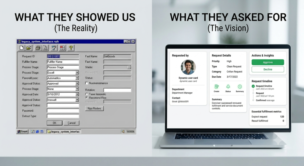
I had a genuine face-palm moment. Not because the ambition was unreasonable. Wanting a clean, modern experience is a completely fair goal but because the path they’d imagined to get there had nothing to do with how design, data, or platforms actually work. Low-code doesn’t mean low-thought. It means the effort moves from writing code to making good decisions and good decisions take time, discovery, and a bit of humility about what you don’t know yet.
I feel like this is the trap in a sentence: when a client insists on heavy customisation while ignoring the value of staying Out-of-the-Box (OOB), they’re not just asking for a redesign. They’re asking us to help them avoid confronting the actual problem, which is that their workflows — not their pixels — are what’s broken.
2. The Misconceptions We Keep Running Into
Legacy systems were often built in an era of rigid, arbitrary UI rules. Migrating away from them means directly confronting those rules and discovering how many of them were never actually true.
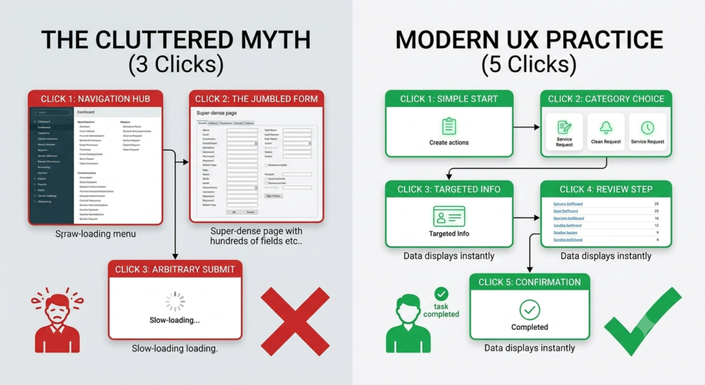
- “Everything must happen in 3 clicks.”
This is probably the most stubborn myth in enterprise UX, and it’s been thoroughly debunked. There’s no magic threshold where frustration spikes at click number four. What actually frustrates users is uncertainty — not knowing whether the next click gets them closer to done. A cluttered single page with a hundred links to satisfy an artificial “3-click” limit is a worse experience than five clean, fast-loading steps that clearly show progress.
I said exactly this in a workshop once: that the 3-click rule was a relic from early-2000s website design, not enterprise workflow design, and the room went quiet. Properly quiet. The kind of silence where you can hear someone reconsidering a belief they’ve held for fifteen years. When I asked what data supported the rule internally, there wasn’t any. Not a survey, not a drop-off metric, nothing. Just tradition, treated as fact.
2. “Requesters, fulfillers, and approvers should share one interface.”
It sounds efficient. It isn’t. Requesters need a guided, simplified Service Portal that hides backend complexity.
Fulfillers need a dense, fast, multi-tasking Workspace built for volume. Forcing both personas into the same layer satisfies nobody and slows everybody down — like asking a barista and a customer to use the same till screen.
3. “No scrolling, and definitely no wasted space.”
Users, we were told, hate to scroll. Again, no data behind this, just conviction. Moderate, well-spaced scrolling on a vertically organised form is intuitive. Progressive disclosure, showing information only when it’s relevant beats a cramped, everything-at-once layout every time.
4. “Three-column rows and inline labels keep everything visible.”
Squeezing data into dense multi-column layouts with inline labels might feel efficient on paper, but it forces the eye to zigzag across the screen and drives up cognitive load. Clear vertical hierarchy wins, even if it takes a touch more space.
5. “200+ pending approvals sitting in a queue is just how it is.”
This one isn’t a UI problem at all — it’s a process ownership problem wearing a UI costume. No layout redesign fixes a queue that’s structurally too deep. That’s a process mining conversation, not a design conversation.
6. “If an approver spots a mistake at the final stage, restart the whole chain.”
This might be the most operationally painful one. A request should never have to walk back through every stakeholder from scratch because of an error caught at the last mile. That’s not rigor, it’s a workflow that never learned to fail gracefully. The fix isn’t a custom “rework” button that quietly overrides platform logic — it’s proactive validation earlier in the chain, and the ability to route back to a specific stage rather than resetting the whole ladder.
And there’s more where these came from. This list keeps growing every time we open a new workshop.
3. How We Push Back — Without It Becoming a Fight
Pushing back well means moving the conversation away from opinion and onto evidence.
- Talk about information scent, not click counts. Clear categorisation and progressively specific navigation beats an arbitrary click budget every time.
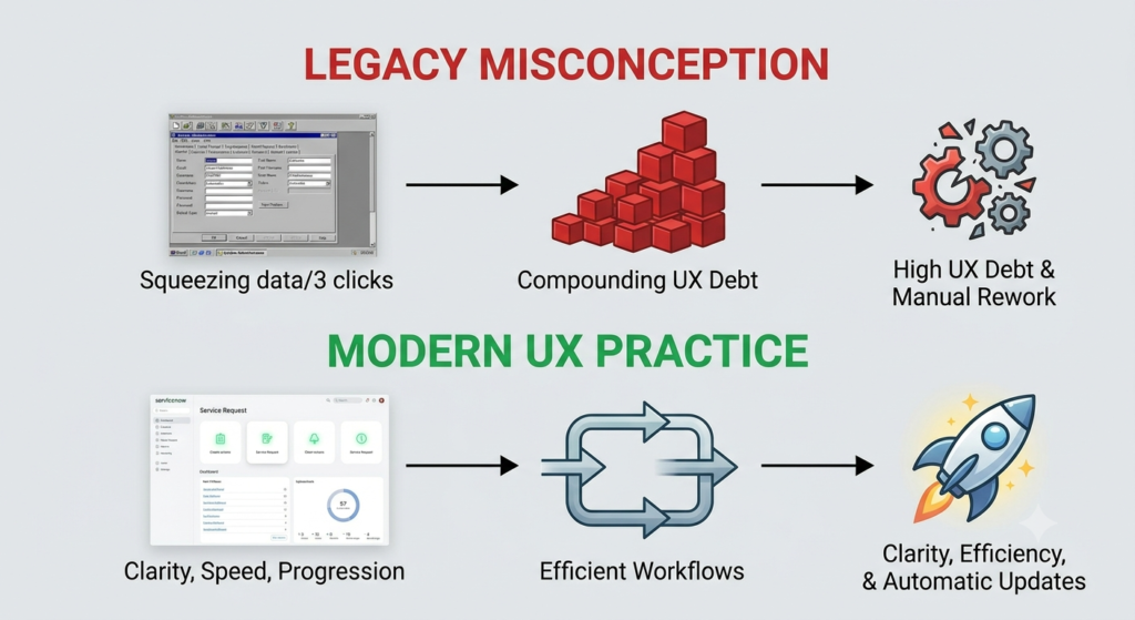
- Name the cost as “UX debt.” It behaves exactly like technical debt. It quietly compounds, and eventually shows up as higher support costs, lower satisfaction, and slower systems. Calling it “debt” instead of “style preference” tends to reframe the conversation, because everyone in the room already understands what debt costs.
- Follow the workflow, not the screen. A queue of 200+ approvals is a process signal, not a design brief. Process mining shows you where the actual friction lives.
- Ask for the metric before the mockup. “How will we know this worked?” is a deceptively powerful question. Task completion time, drop-off rate, error frequency — pick one. Without a metric, a design preference is just a guess wearing a suit.
4. What We Weigh Before Agreeing to Go Custom
Before any team agrees to step outside OOB and build a bespoke portal, a few things need honest evaluation:
- PaaS is not a blank canvas. ServiceNow is built to be extended through its own framework not rewritten in custom HTML/CSS. Treat it like a new front-end project and you quietly break its upgrade path.
- The upgrade penalty is real. Every custom widget or overridden pages exempts itself from automatic updates. Every future upgrade becomes manual remediation and regression testing forever, or until someone finally rips it out.
- Latency doesn’t care how few clicks it took. If data has to be fetched on demand from scattered legacy sources because there’s no centralised model, a beautifully custom page will still feel slow. And slow always loses.
- Foundational data has to be clean first. If something as basic as the relationship between business unit, department, and location is inconsistent across the company, no interface, custom or OOB, will feel seamless. It’ll just look broken in a nicer font.
- ROI has a ceiling on cosmetic work. Budget spent on bespoke layouts for simple forms returns far less than the same budget spent automating genuinely complex fulfilment workflows.
None of this is exciting to explain to a client who’s expecting a demo of something beautiful. But it’s the difference between something that is stable and survives three platform upgrades and something that becomes next year’s legacy system.
5. Negotiating Across Cultures: What I’m Learning in the Middle East
This part has probably taught me the most, because it’s the part no architecture certification prepares you for.
- “Being the best means showing off.”
There’s a genuine cultural pride in being seen as world-class, and world-class is often read as visually distinctive. Handing over a plain OOB portal can land as low-effort, even when it’s the technically superior choice. The reframe that’s worked for me: prestige isn’t the paint job, it’s the speed, the automation, and the flawless delivery underneath it. The world’s best enterprises aren’t recognised for custom buttons — they’re recognised for things simply working. - “Being different is in our nature.”
There’s a strong, sincere belief that internal processes are too unique to fit a standard mould — which naturally pushes toward heavy customisation to protect that identity. Rather than argue against it, I’ve found it works better to validate it: channel that uniqueness into branding, high-value business logic, and specialised integrations within OOB boundaries. Save the custom engineering budget for the backend automation that actually reflects what makes them different — not the placement of a label. - Respecting hierarchy and relationships.
Decisions here run through senior leadership and rest on trust built over time. A flat technical “no” can read as confrontational, even when it’s correct. What’s worked better is a consultative approach — live demos, prototypes, and case studies that let the platform make the argument, framed as protecting their long-term investment rather than contradicting their preference.
6. Where This Leaves Me
If there’s one thing I’m sure of, it’s this: a lift-and-shift dressed up as modernisation is never the answer. Giving a client exactly what they ask for – a shinier version of a broken system – guarantees technical debt, brittle upgrades, and a portal that fights its own platform from day one.
But I’ll be honest, I don’t have this fully worked out yet. Every workshop surfaces a new belief that needs gently, respectfully dismantling, and every negotiation teaches me something I didn’t know about how trust gets built in this part of the world.
What I do know is that the role isn’t “the person who says no”, it’s the person who helps a client see what they actually need, even when that’s different from what they walked in asking for.
I’m still learning this one in real time, and I’ll keep sharing as the picture gets clearer.
—
Sources referenced: NN/g on the 3-click rule myth, Think Design on UX debt, and various ServiceNow community resources on Service Portal and Workspace design guidelines.
Leave a Reply